Thursday, December 25, 2014

Lela Stankovic - My Watercolor Painting Style

1) My painting style is multi-layered build of one color layer at the top of another until desired color, intensity and overall appearance is accomplished. I start with very careful observation of the painting subject. Then I ask myself questions ... many of them. Once I am comfortable with what I plan to accomplish with a painting, what to include and what to exclude, I stretch watercolor paper and draw the composition. Only then painting with color begins.

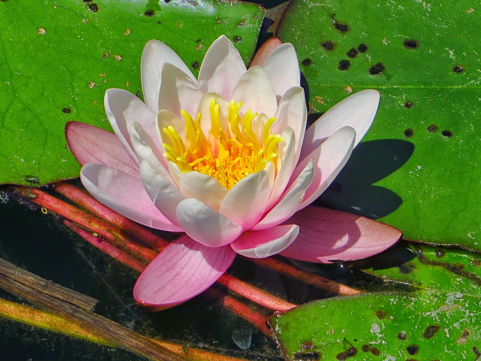
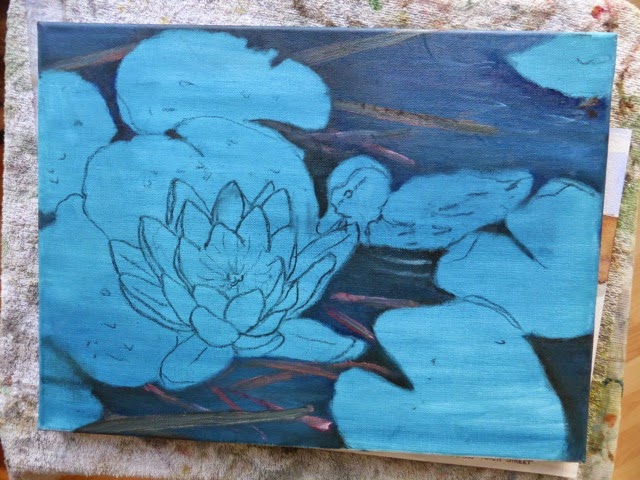
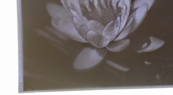
I usually paint the main subject first, so that I can get a feeling how to handle background and the rest of the painting. Here I painted water lily by following the same painting process described in detail in my e-book "Painting Glorious Rose Flowers in Watercolor - in 7 Stages". In a nutshell, I paint first the value scale, then color of light and finally all shadow components. The gray dots are masking fluid, used to preserve white of the paper for later stages.


2) Initial color layer in shades of yellow, pink and blue.

3) Painted leaves. The adjustments will be completed in the final painting stage.

4) Painted first water layer.

5) Painted additional color layers on the grass and lily roots.

6) Removed masking fluid.
 
7) Painted all remaining elements, dew drops, ladybug and her reflection, except hart of the water lily. Many color layers were applied. In some areas more than 10 layers.

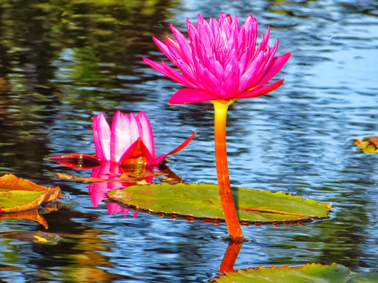
8) The last 7-th stage - final adjustments of the whole painting, including painting all fine details. Here is the completed watercolor painting. In this stage I spend more time observing the painting then actually painting it. Every detail, edge, color, shadow is checked and corrected as needed.


"Water Lily"
Lela Stankovic
8 X 6 inches
Watercolor on Arches 140 lb hot pressed paper
http://www.lelacreations.com


Tuesday, December 23, 2014

Sylvia Young


step 1.mapping out the arrangement and putting in the background
step 2 working on the water lily leaves .
step 3 at lst working on the lily and ducklings.                   
                                                                               
 Final step, fluffing up the duckling and putting the stamens in the water lily.
A  really enjoyable challenge. 
 sylsarttrials.blogspopt.com.

Friday, December 19, 2014

Geneviève T.


Je peins à l'acrylique sur toile.
Pour le modèle, je n'édite plus mes photos sur papier,
 mais je mets la photo en fond d'écran de mon ordinateur
Je n'ai pas à cherché à reproduire la fleur exactement,
 j'ai donc dessiné à main levé le nénuphar.
Ma première étape est une couche de lavis.
ensuite j'ajoute deux couches voir plus si nécessaire.
Compte tenu de la difficulté de la fleur, j'ai commencé par
le fond ensuite j'ai terminé par le nénuphar.
J'ai mis une couche de vernis pour terminer.


Shirley Bond


Artist Shirley Bond 
Watercolor on watercolor paper 12''x 9"

Process

Photo 1. Light sketch done with pencil on prepared paper copying challenge photo from my tablet.
Photo 2.  Assigning different colors and tones to sketch.I like to cover the whole painting with paint if possible.
Photo 3. ( sorry this photo did not come out well.)
Additional layers of paint added to vary the depth of paint coverage. 
Photo 4. Finished painting. Added fine details.


Friday, December 12, 2014

Horst Hittenberger


  • Artist: Horst Hittenberger
  • Size: 9 by 12
  • Medium & Support: oil on canvas panel
  • Artist Blog: http://horsthittenberger.blogspot.com/
  • Artist Website:
  • Painting Technique : Impressionistic, realistic

1. Value painting

2. Local color

3. Finished painting with detail


Sunday, December 7, 2014

France

artist : France
Size  : 20 x 25 cm
medium and medium : oil on canvas
 
painting process  : a few weeks ago, i done a painting of water lilies. I Refocused a piece of this one .... to correspond to this challenge.

Helen Eaton


Paragraph  1
After drawing lines i (As I've gladly admitted  before, yes, I cheat with a sheet of carbon paper) I blocked colors.


Paragraph  2
Next I tried to add a little life to the big flat areas of color. Some yellows and purples livened up the leaves. Added all kinds of I streaks paint colors from left over on my pallet to the vines ... Hoping They'd start looking right ... they did not.


Paragraph  3
After the bold background colors dried a day or two, It was in time to block the flower. I planned to use alizarin red and white, I used diaxozine  for the purple shaded Areas. It seems to work best for me if get those areas in first and darker than I know they should be.


Paragraph  4
* Blend with new white ... the petals look like mud ...
* Add the middle ... the yellows and oranges smear ...
* Experiment with Those vines again ... what a mess ...
* Try to make the  spots look intentional INSTEAD of like I dropped dark paint blobs on the leaves ... Add Some yellowish greens and purple-leaf greens around the holes .... hmmm ...

*  And this is the Point Where It Happens ... It always happens ... It's the ugly stage ... I wonder if I shoulds give up, if I have the right to call myself an artist, if this one just isn ' meant to be ...


Paragraph  5
Then with fresh eyes and one more try, it comes together. ALTHOUGH it's happened dozens and dozens of times, I'm always surprised when it happens ... and I smile then sign my name in the bottom corner.

Helen Eaton
6 "x 8" Oil on Canvas

Bernard VOLLAT


1> Après avoir téléchargé la photo du défi, je lis la photo avec le logiciel GIMP.
Pour le défi je travaille en format A4(210x297 mm = 8,27x11,7 inches) pour des raison de rapidité, n'ayant pas trop de temps à consacrer à la peinture. Je sélectionne donc une portion de ce format de l'image proposée et je la transforme en gris. Je réduis ensuite le nombre de niveaux de gris à 16. Ceci pour faire ressortir les plages ou l'intensité change. Mon œil a du mal à voir toutes les nuances et cela m'évite de grosses erreurs. Ensuite, j'utilise la fonction du logiciel : filtre/artistique/dessin crayon ; j'obtiens une épreuve comme sur la photo 1 (détail).


2> J'imprime cette image noir et blanc sur du papier à lettre. Toujours pour gagner du temps et parce que je ne suis pas le meilleur en dessin, je fais le transfert par transparence sur une vitre (photo 2) sur le papier ou je vais peindre (300g/m2).
Pour les formats plus grands ou pour une toile je fais le dessin avec la méthode des carrés.


3> Ensuite, je mets en couleur par couches successives de glacis en partant du plus clair au plus foncé. (photo 3). Les numéros correspondent aux nombres de couches déjà passées. A droite le modèle noir et blanc du tirage initial que je garde sous les yeux. Pour les couleurs je garde l'image sur l'écran de l'ordinateur, les épreuves imprimées sur mon imprimante ne me satisfaisant jamais. Cela permet aussi d'agrandir facilement l'image pour certains détails.


4> Je continue couches après couches jusqu'au résultat désiré (photo 4-final). Cette méthode est inspirée des maîtres hollandais, succession de couches transparentes, même si j'utilise l'acrylique.
Je suis équipé entièrement avec la marque Liquitex car contrairement à l'huile le mélange des marques peut être très nuisible en acrylique, chacun ayant ses propres résines synthétiques.
Mes glacis sont très liquides et sont faits avec un mélange de 50 % de medium glacis dilué avec 50 % d'eau déminéralisée, la couleur étant ajoutée par très petite quantité.
J'utilise les pinceaux Raphaël série Kaerell 8.., en fin de séance je nettoie au savon et à l'alcool à bruler.

Artist: Bernard VOLLAT
Size of Painting: A4 (210x297 mm = 8,27x11,7 inches)
Medium & Support: Acrylic on paper (300g/sqare meter)
Artist Blog: No Blog
Artist Website: No website

Valérie M. - "Zen flower"


Paragraph 1  : I always draw and paint directly from the picture on my computer or my Ipad. I work with a mechanical pencil 2B on watercolor paper 300g, trying to do some contour drawing, without erase any line. Mistakes and bad strokes are sometimes interesting and bring some live in the finished painting.


Paragraph 2 : I start my painting with some dark values on the petals, always dry on dry, trying to find immediately the good color and the right value.  I add some water near the dark value to let the pigment flow in for the remaining petal area. 


Paragraph 3 : At this stage I was within a hair's breadth to put my painting in trash... Not satisfy with the shape, the values and the spirit which I would like to pass on in the painting.
I take a break.... ;o)


Paragraph 4 :  Some shadows added, some pencils strokes underlined, some colored  and contrasting shapes and splatters to loose up my mind and my finished painting ! Not very proud of it, but I spent a good moment, it's the most important : the pleasure of painting, without stress; after all , it's only a sheet of paper  and a little bit color !!!!

Friday, November 28, 2014

Terri Einer, Einer Arts


Picture 4 is my finished painting.


Picture 3 is the blocked in shapes or underpainting


Picture 2.  I am an acyrlic and pastel painter, so I first imaged the
 image in each medium, deciding to do a pastel.  I selected black paper
for my support and then selected my color pallet.


Picture 1 is the cropped image.  I did not want the Water Lily sitting
 squarely in the center of the picture, so I cropped it for better
 composition.

Terri Einer
New website: www.terrieiner.com

Terri Einer, Einer Arts
8x10
Soft Pastel on 300 Grit Black Paper
www.einerarts.blogspot.com
 www.facebook.com/einerarts


Tuesday, November 25, 2014

Challenge 50 - Teach us About Your Painting Style


This challenge is very important for two reasons.

The first one is, with your very generous help, PADT blog has been happily existing and supporting art for more than 5 years. Can you believe it? To me it feels like I had posted the first challenge just a few months ago. Thank you so much for being PADT's blood and soul and keeping it alive & supporting its mission for all these years.
I can't be more proud of all of you and more grateful for all your help and support over the years. Thank you very much!

The second reason is, this is our 50th challenge. It is a special anniversary, and it calls to be specially marked.

I was thinking what would be interesting and important for all of us to grow as artists, and how this new challenge can help even more. Needless to say, words such as Learning and Education were first and foremost coming to my mind. And that is how the idea for the new slightly more demanding challenge and composition was born.

About the challenge and composition

In this challenge I am kindly asking you to write your post and teach us how you made your painting. I would like you to teach all of us about your painting style and important components (process, thoughts, ideas, challenges, ...) you think the others will learn and benefit from. I remember the saying one of my university teachers was frequently repeating "The one knows the subject only if she/he can teach the others."

Here is how we will together accomplish it. You will paint the challenge and take pictures as you progress. At the end please send me maximum 5 pictures of your painting in different stages (Let's name them Picture1, Picture2, Picture3, Picture4, Picture5).

For each of the pictures please kindly provide a short paragraph describing the stage you are in, why you did it that way so far, and what did and did not work as you imagined. Each paragraph should be named (Paragraph1 (accompanying Picture1), Paragraph2 (accompanying Picture2),  etc.).

For the challenge, I have chosen a moderately complex subject that has well defined light and shadow areas. As in the Old Master's paintings it has ~80% dark values and ~20% light values, which allows the focus to glow and stand out even more.

You are free to modify the composition as you like and tell us why and how you did it.

Please send your paintings by Jan 11, 2015. The next challenge will be posted on Jan 12,  2015. 

Best regards and Happy Painting!
Lela

Bernard VOLLAT


Mon nom : Bernard VOLLAT
Taille : A4 (210 x 297 mm)
Support : Papier Canson 300g/m2
Medium : peinture acrylique (marque Liquitex)
Technique : glacis successifs

Sabine from Painting in Tuscany


- Sabine from Painting in Tuscany
- size 34,5 cm x 23 cm (13,6 x 9,1 inches)
- Watercolor on paper (Fabriano rough 300 gsm/202 lbs)

On my blog I'm also showing my step-to-step work for this and a second, a bit more free painting. 

Thursday, November 20, 2014

Sylvia Young


“garlic, oil and tomatoes” 

Monday, November 17, 2014

Geneviève T.


Geneviève T.
acrylic
24X30
http://mesmotsdoubs.blogspot.fr